")
")
CSSで背景色・背景画像を設定するbackgroundプロパティについて解説していきたいと思います。
CSSの基本的なプロパティですが、実はあまり知らなかった!といった方法もあるのがbackgroundプロパティです。
そんなbackgroundプロパティの基本・使い方について見ていきたいと思います。
目次
- CSSのbackgroundプロパティとは
- background-color … 色
- background-image … 画像など
- background-size … 背景のサイズ
- background-repeat
- background-position
- background-attachment
- background-origin
- background-clip
- backgroundをショートハンドで書く
CSSのbackgroundプロパティとは
CSSのbackgroundプロパティとは、要素の背景を指定するためのプロパティです。
Webの背景は主には「色を付ける」「画像を入れる」などで背景が作られています。(何も指定されていないWebの背景は基本的に白です。)
backgroundプロパティの種類
実際に使用されるbackgroundプロパティにはいくつか種類があります。
- background-color:… 色
- background-image:… 画像など
- background-size:… 背景のサイズ
- background-repeat:… 背景の繰り返し
- background-position:… 背景の位置
- background-attachment:… 背景の固定
- background-origin:… 背景の基準点
- background-clip:… 背景と重なる要素のクリッピング
ぱっと見てもわからないですよね。
backgroundには、「liner-gradient」「radial-gradient」などがありますが、それらはまた別の記事にて解説したいと思います。(長くなってしまうため…)
それでは一つひとつサンプルを見ながら解説を見ていきましょう。
background-color … 色
background-colorプロパティは、その名のままで背景に色を指定する時に使います。
<div class="box"></div>body {
background-color: skyblue;
}
.box {
margin: 0 auto;
width: 100px;
height: 100px;
background-color: yellow;
}出力結果

上記サンプルではbodyに水色が指定されています。
background-color: skyblue;
その中にあるボックスにはbackground-color: yellow;が指定されています。
色の値の指定方法は、サンプルのようにblueやyellowといった色の名前で指定することもできますし、一般的には16進数というもので色を指定したりします。
Photoshopやイラストレーター、XDなどのデザインツールを使っている人であればわかりやすいですよね。3桁から6桁の数字で表されるカラーコードになります。

16進数以外にも、rgbやrgbaで指定することができます。(rgbaのaは透過度になります)
16進数は短縮形で書ける
ちなみに16進数での記載は、カラーコードによって短縮して指定することができます。
たとえば黒や白など、「#000000」「#ffffff」は
#000000 → #000
#ffffff → #fff
と書くことができ、
他にも
#009944 → #094
などと短く指定することができます。
なるべく短くことでCSSファイルの容量を削減することができます。容量を削減することでサイトの高速化に繋がります。カラーコードを短縮したからといって、高速化の効果が凄いわけではありませんが、大きなCSSファイルなどでは、結構ファイルサイズを削減することができたりします。
background-image … 画像など
次にbackground-imageについて見ていきたいと思います。
background-imageは主に背景に画像を指定するためのプロパティです。まずはサンプルを見てみましょう。
<div class="box">これは背景のテストです</div>.box {
width: 300px;
height: 185px;
background-image: url("https://jajaaan.co.jp/wp-content/uploads/2020/04/css-background.png");
background-size: 300px; 185px;出力結果

この記事のアイキャッチを指定してみました。サンプルだと背景画像かどうかがイマイチわかりにくいかもしれませんが、要素内のテキストが画像の上に表示されていることで背景画像が指定されていることが分かります。
background-imageの指定方法
background-imageの指定方法ですが、以下のような書き方で指定します。
background-image:url("...");
background-imageと書いた後にurl(〇〇)と書きます。
〇〇の部分は画像URLです。URLと書いていますが、https〜ではじまるような絶対パスと呼ばれるパスを書く必要はありません。パスについての詳細説明は割愛しますが、相対パス(../img/〇〇.jpg)、ルートパス(/img/〇〇.jpg)などで指定することも可能です。
サンプルでは本ページのアイキャッチの画像のURLをそのまま指定しています。
後述していますが、サイズの指定(background-size)を一緒にしてあげる必要があります。
複数の背景画像も指定できる
ちなみにURLの部分は繰り返し書くことで複数の背景画像を指定することができます。
以下サンプルです。
<div class="box">これは背景のテストです</div>.box {
width: 300px;
height: 185px;
background-image: url("https://jajaaan.co.jp/wp-content/uploads/2020/04/css-background.png"),
url("https://jajaaan.co.jp/wp-content/uploads/2020/02/matsumoto-shi.jpg");
background-size: 50%, 50%;
background-repeat: no-repeat, no-repeat;
background-position: left top, right top;
}出力結果

カンマで区切ることで複数の画像を指定することができます。複数指定する場合は、背景画像サイズなどを指定するプロパティもそれに合わせて指定してあげる必要があります。
background-size … 背景のサイズ
先程のサンプルですでに使用していたプロパティですが、背景画像のサイズを指定するプロパティです。
background-size: 100px; 200px;
前述した通りですが、background-imageについては、表示サイズを指定してあげる必要があります。
サイズの指定方法では、数値以外のもので、以下のようなものがあります。
| cover | 画像の縦横比を崩さずに、可能な限り要素いっぱいに拡大して表示する |
|---|---|
| contain | 画像全体を表示させ、かつ、縦横比を変えずにできるだけ大きく表示させる |
| auto | 縦横比を維持して拡大縮小する |
背景画像の指定でよく使うのは「cover」や「contain」かと思います。
イマイチ違いが分かりにくいかと思いますのでサンプルを作成してみました。
<div class="box">これは「50%」のテストです</div>
<div class="cover">これは「cover」のテストです</div>
<div class="contain">これは「contain」のテストです</div>.box {
margin-bottom: 20px;
width: 300px;
height: 185px;
background-color: yellow;
background-image: url("https://jajaaan.co.jp/wp-content/uploads/2020/02/matsumoto-shi.jpg");
background-size: 50%;
background-repeat: no-repeat;
}
.cover {
margin-bottom: 20px;
width: 300px;
height: 150px;
background-color: yellow;
background-image: url("https://jajaaan.co.jp/wp-content/uploads/2020/02/matsumoto-shi.jpg");
background-size: cover;
background-repeat: no-repeat;
}
.contain {
width: 300px;
height: 150px;
background-color: yellow;
background-image: url("https://jajaaan.co.jp/wp-content/uploads/2020/02/matsumoto-shi.jpg");
background-size: contain;
background-repeat: no-repeat;
}出力結果

それぞれbackgroundを指定している要素に対して、画像がどのような拡がりを見せているのか分かるかと思います。
background-size:coverは、要素いっぱいに背景画像が拡がっているのが分かります。その代わり画像の下側は要素を超えてしまうので消えてしまっています。
background-size:containは、背景画像が要素をはみださない形で表示されているのが分かります。
それぞれ使い道は異なります。
よくある例として、要素をディスプレイ幅いっぱいにして、その背景に画像を入れたい、といった表現です。その場合はcoverを使うことが多いです。
containは画像の縦横比に依存するため、背景を作る場合としては少し使いみちが少ない印象です。要素の縦横比と背景画像の縦横比が揃っていればcoverでも充分です。
background-sizeとbackground-positionを一緒にしているすことで見せ方を変えることができます。
background-repeat
background-repeatは、背景画像をリピートさせる時に使います。
背景をリピートさせたくない時は、「no-repeat」と指定します。
さらに、横だけや縦だけといった形でリピートをさせることもできます。
サンプルを見てみましょう。
<div class="repeat">これは「repeat」の例です</div>
<div class="no-repeat">これは「no-repeat」の例です</div>
<div class="repeat-x">これは「repeat-x」のテストです</div>
<div class="repeat-y">これは「repeat-y」のテストです</div>.repeat {
margin-bottom: 10px;
width: 300px;
height: 185px;
background-color: yellow;
background-image: url("https://jajaaan.co.jp/wp-content/uploads/2020/02/matsumoto-shi.jpg");
background-size: 50%;
}
.no-repeat {
margin-bottom: 10px;
width: 300px;
height: 185px;
background-color: yellow;
background-image: url("https://jajaaan.co.jp/wp-content/uploads/2020/02/matsumoto-shi.jpg");
background-size: 50%;
background-repeat: no-repeat;
}
.repeat-x {
margin-bottom: 10px;
width: 300px;
height: 185px;
background-color: yellow;
background-image: url("https://jajaaan.co.jp/wp-content/uploads/2020/02/matsumoto-shi.jpg");
background-size: 50%;
background-repeat: repeat-x;
}
.repeat-y {
width: 300px;
height: 150px;
background-color: yellow;
background-image: url("https://jajaaan.co.jp/wp-content/uploads/2020/02/matsumoto-shi.jpg");
background-size: 50%;
background-repeat: repeat-y;
}出力結果

(サンプルの画像は繰り返すのに適している画像ではありませんが、、繰り返しの説明としては逆にわかりやすいかと思います。)
要素の箇所はわかりやすくするため黄色くしています。
「repeat」の場合は、要素いっぱいに背景画像が繰り返されています。
「no-repeat」の場合は、背景画像が1つのみで繰り返されていません。
「repeat-x」の場合は、背景が横方向にのみ繰り返されています。
「repeat-y」の場合は、背景が縦方向にのみ繰り返されています。
background-position
background-positionとは、画像の配置位置を指定するプロパティです。

top、right、bottom、left、といった指定はもちろん、%での指定や、中央に配置する場合はcenter、といった指定方法があります。
サンプルを見てみましょう。
<h3>初期値:top left</h3>
<div class="background repeat"></div>
<h3>中央寄せ:center</h3>
<div class="background center"></div>
<h3>右寄せ:right</h3>
<div class="background right"></div>
<h3>左寄せ:left</h3>
<div class="background left"></div>
<h3>上側中央寄せ:top center</h3>
<div class="background top-center"></div>
<h3>右上寄せ:top right</h3>
<div class="background top-right"></div>
<h3>下側中央寄せ:bottom center</h3>
<div class="background bottom-center"></div>
<h3>左下寄せ:left bottom</h3>
<div class="background left-bottom"></div>
<h3>右下寄せ:right bottom</h3>
<div class="background right-bottom"></div>.background {
margin-bottom: 10px;
width: 300px;
height: 120px;
background-color: yellow;
background-image: url("https://jajaaan.co.jp/wp-content/uploads/2020/04/background-position1.png");
background-repeat: no-repeat;
background-size: 100px;
}
.background.center {
background-position: center;
}
.background.right {
background-position: right;
}
.background.left {
background-position: left;
}
.background.top-center {
background-position: top center;
}
.background.top-right {
background-position: top right;
}
.background.bottom-center {
background-position: bottom center;
}
.background.left-bottom {
background-position: left bottom;
}
.background.right-bottom {
background-position: right bottom;
}出力結果


background-positionプロパティを何も指定していない場合は、左上から背景画像が配置されます。
中央寄せや、右寄せなどの場合は、center、right、といった記述をするだけです。
上側右寄せなどにしたい場合は、top right、といった「上で右」といった指定をしてあげる必要があります。
pxや%などを使って細かく位置指定をする
pxや%といっと単位でも背景位置を指定することができます。
細かく位置指定をする場合は、pxなどを使う必要があります。
サンプルを見てみましょう。
<h3>上から左から50px</h3>
<div class="background top-left50"></div>
<h3>top 左から50%</h3>
<div class="background top-left50p"></div>
<h3>top 左から100%</h3>
<div class="background top-left100p"></div>
<h3>top 右から90%</h3>
<div class="background top-right100p"></div>
<h3>top 上から50% 左から50%</h3>
<div class="background p50p"></div>
<h3>top 上から50px 左から120px</h3>
<div class="background top50-left120"></div>
<h3>top 上から50px 右から120px</h3>
<div class="background top50-right120"></div>.background {
margin-bottom: 10px;
width: 300px;
height: 120px;
background-color: yellow;
background-image: url("https://jajaaan.co.jp/wp-content/uploads/2020/04/background-position1.png");
background-repeat: no-repeat;
background-size: 100px;
}
.background.top-left50 {
background-position: 50px;
}
.background.top-left50p {
background-position: top left 50%;
}
.background.top-left100p {
background-position: top left 100%;
}
.background.top-right100p {
background-position: top right 90%;
}
.background.p50p {
background-position: 50%;
}
.background.top50-left120 {
background-position: top 50px left 120px;
}
.background.top50-right120 {
background-position: top 50px right 120px;
}出力結果


細かく背景の位置を指定できているのが分かるかとおもいます。
位置を決める際に、上下左右から何px、といった指定をしたい場合は、top/right/bottom/leftと一緒に記述をしてあげる必要があります。
background-position: top 50px right 120px;
この場合、上から50px、右から120pxの位置から背景画像がはじまる形になります。
background-attachment
background-attachmentは、背景を固定したい時に使うプロパティです。
指定できる値としては、scroll、fixedがあります。
scrollは初期値であり、固定せずにしたい場合に使います。使うシーンとしては、一度fixedを指定した要素を何かしらのタイミングで初期値に戻したい場合などに使います。
fixedは、スクロールしても背景が固定されている状態になります。
サンプルを見てみましょう。
<h3>fixed</h3>
<div class="background fixed">テキストテキストテキストテキストテキストテキストテキストテキストテキストテキストテキストテキストテキストテキストテキストテキストテキストテキストテキストテキストテキストテキストテキストテキストテキストテキストテキストテキストテキストテキストテキストテキストテキストテキストテキストテキストテキストテキストテキストテキストテキストテキストテキストテキストテキストテキストテキストテキストテキストテキスト</div>
<h3>scroll</h3>
<div class="background scroll">テキストテキストテキストテキストテキストテキストテキストテキストテキストテキストテキストテキストテキストテキストテキストテキストテキストテキストテキストテキストテキストテキストテキストテキストテキストテキストテキストテキストテキストテキストテキストテキストテキストテキストテキストテキストテキストテキストテキストテキストテキストテキストテキストテキストテキストテキストテキストテキストテキストテキスト</div>.background {
padding: 15px;
width: 300px;
background-size: 400px;
}
.background.fixed {
background-image: url("https://jajaaan.co.jp/wp-content/uploads/2020/02/matsumoto-shi.jpg");
background-attachment: fixed;
}
.background.scroll {
background-image: url("https://jajaaan.co.jp/wp-content/uploads/2020/02/matsumoto-shi.jpg");
background-attachment: scroll;
}出力結果
fixedは背景画像がスクロールせずに要素内に固定されているのが分かります。
background-origin
background-originは、背景画像の配置の基点を指定するプロパティです。
設定できる値はグローバル値を除き、「border-box」「padding-box」「content-box」があります。
background-originを理解する前に、要素のboxモデルについて理解する必要があります。

要素のサイズは上の図のように、4つの要素から決まっています。
わかりにくいと思うのでサンプルを見てみましょう。
<h3>border-box</h3>
<div class="background border-box"></div>
<h3>padding-box</h3>
<div class="background padding-box"></div>
<h3>content-box</h3>
<div class="background content-box"></div>.background {
margin: 10px;
padding: 30px;
width: 300px;
height: 100px;
border: 10px dashed #000;
background-image: url("https://jajaaan.co.jp/wp-content/uploads/2020/02/matsumoto-shi.jpg");
}
.background.border-box {
background-origin: border-box;
background-repeat: no-repeat;
}
.background.padding-box {
background-origin: padding-box;
background-repeat: no-repeat;
}
.background.content-box {
background-origin: content-box;
background-repeat: no-repeat;
}出力結果

「border-box」は要素のborder範囲を含めて背景画像を配置します。
「padding-box」はborder範囲を除き、要素のpaddingの範囲を含めた背景画像を配置します。
「content-box」は、border範囲、padding範囲を除き、要素のコンテンツエリアを基点に背景を設置します。
これらの表現は、htmlタグを入れ子にすることでも同じような表現ができますが、その場合は無駄なDOMが増える形となってしまうため、background-originのような表現手法を覚えておくといいでしょう。
background-clip
background-clipは、背景の拡張範囲を決めるプロパティです。
background-originと似ていますが、background-originは背景画像の開始の起点を定めるプロパティであったのに対し、background-clipは背景の描画領域を定めるプロパティです。
まずはサンプルを見てみましょう。
<h3>border-box</h3>
<div class="background-clip border-box"></div>
<h3>padding-box</h3>
<div class="background-clip padding-box"></div>
<h3>content-box</h3>
<div class="background-clip content-box"></div>
<h3>text</h3>
<div class="background-clip text">SampleText</div>.background-clip {
margin-bottom: 15px;
padding: 15px;
width: 300px;
height: 100px;
font-weight: bold;
font-size: 40px;
text-align: center;
background-image: url("https://jajaaan.co.jp/wp-content/uploads/2020/02/matsumoto-shi.jpg");
border: 10px dashed #000;
}
.background-clip.border-box {
background-clip: border-box;
}
.background-clip.padding-box {
background-clip: padding-box;
}
.background-clip.content-box {
background-clip: content-box;
}
.background-clip.text {
-webkit-background-clip: text;
color: transparent;
}出力結果

さきほどのbackground-originと比較してみてほしいのですが、background-originはborderやpaddingのエリアで背景画像が途切れるといったことがありません。あくまで背景画像を描写する起点を定めるためのプロパティです。
それに対してbackground-clipは、borderやpaddingなどで背景画像がマスクされているのが分かります。
Photoshopやイラストレーターをよく使う人であればおなじみの「クリッピングマスク」ですね。
このbackground-clipを使うことで、背景を前景にテキストを切り取って表示することもできます。(サンプルの4番目)
背景画像のみではなく、通常背景やグラデーションさせた背景でも可能です。
おしゃれなデザイン作成に役立つ方法ですね。
backgroundをショートハンドで書く
backgroundプロパティはショートハンドで書くこともできます。
これまで解説してきたbackgroundプロパティを単体で使うことってあまりないのではないのでしょうか?
colorやsizeなど、同時に指定するケースが多いと思います。
しかし毎回、
background-color: 〇〇
background-size: 〇〇
と書いていると冗長な感じがしますよね。
そういった場合はショートハンドで記述するようにしましょう。
ショートハンドで記述することによってCSSファイルの容量を削減することができます。
backgroundのショートハンドでの書き方
ちなみにショートハンドで書くことによって、Android4.4以下などではうまく動作しない場合があるので注意してください。(そもそもAndroid4.4以下の古いバージョンでは、基本的なbackgroundプロパティの挙動自体がおかしかったりします)
それでは書き方について見ていきましょう。ショートハンドでの書き方は以下のように記述します。
background: #000 url("画像URL") no-repeat border-box left top/contain fixed content-box;
ためにしにサンプルを見てみましょう。
<h3>ショートハンドで書かなかった場合</h3>
<div class="background normal"></div>
<h3>ショートハンドで書いた場合</h3>
<div class="background shorthand"></div>.background {
width: 200px;
height: 50px;
}
.background.normal {
background-color: yellow;
background-image: url("https://jajaaan.co.jp/wp-content/uploads/2020/04/background-position1.png");
background-size: contain;
background-repeat: no-repeat;
background-position: center;
}
.background.shorthand {
background: yellow
url(https://jajaaan.co.jp/wp-content/uploads/2020/04/background-position1.png)
no-repeat center / contain;
}出力結果

どちらも表示は同じですが、CSSの書き方が異なります。
ショートハンドで書くことによってかなり記述量を減らすことができています。
指定する順番に注意
backgroundのショートハンドでの指定ですが、指定する順番、スラッシュの位置によって正しく指定されないので注意が必要です。
注意する箇所は、位置とサイズを指定する箇所です。
スラッシュで区切る箇所は、かならず、位置 / サイズ となるように指定するようにしましょう。
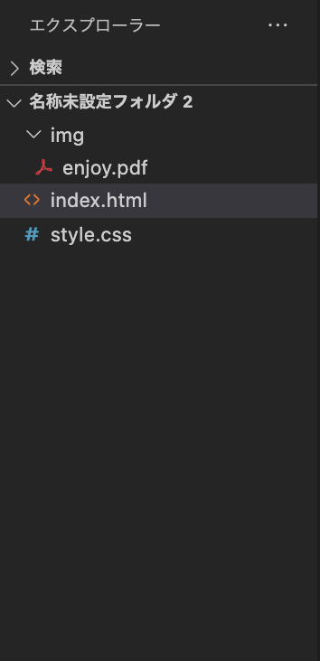
チェックテスト
チェックテストを確認する
下記フォルダ構成の際に、style.cssファイルにbackgroud-imageプロパティを用いてenjoy.pdfファイルを表示したい際のcssのコードをdiscordにて共有ください。